
Table of Contents:
Understanding the Appeal of Unique Orange Juice Bottles
When consumers stroll down the beverage aisle, it's the visually compelling that often leads to a product being plucked off the shelf. Unique orange juice bottles have a charm that goes beyond mere container function; they convey a brand's story, ethos, and commitment to quality. In a marketplace saturated with choices, standout packaging can be the difference between a bottle that lingers on the shelf and one that goes home with the buyer.
The attractiveness of engaging orange juice designs is rooted in human psychology. We are drawn to objects that appeal to our senses, instigate curiosity, and promise a gratifying experience. The right combination of aesthetics and practicality in the bottle design can evoke a sense of natural freshness, suggesting the juice inside is just as delightful.
Moreover, uniqueness in bottle design can often reflect an attention to detail that customers may associate with the quality of the product itself. When an orange juice bottle stands out, it's not just seen as a vessel for the juice; it becomes a token of the brand's reputation for excellence. Therefore, investing in distinctive packaging design isn't just about aesthetics—it's a vital aspect of the product's identity and market presence.
Design Elements that Make Orange Juice Bottles Pop
The design elements of orange juice bottles play a crucial role in capturing consumer attention. One such element is the bottle shape. A unique silhouette can make a product stand out on a crowded shelf. Some brands may opt for slender, elegant curves, while others might choose a bold, angular profile, each conveying a different brand personality and customer appeal.
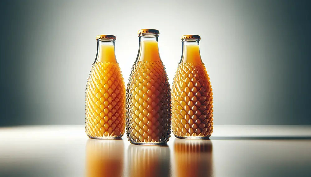
An often underrated component is the bottle's texture. Textured surfaces can add a tactile dimension to the consumer experience, inviting them to pick up and engage with the product. For instance, a bottle that mimics the feel of an orange peel can intensify the perception of freshness and authenticity.
The cap design also contributes to the overall appeal. An easy-to-open cap that doubles as a design feature can enhance usability while supporting the brand's visual identity. Whether it's a vibrant color that complements the bottle or a novel shape that adds fun to function, cap designs are an opportunity for innovation.
Finally, typography and graphics are vital in making orange juice bottles pop. Bold lettering, clear fonts, and playful graphics not only inform the consumer but also add character to the product. Striking imagery, such as illustrations of lush orange groves or splashes of juice, can create a vivid mental image of the taste and quality of the juice inside.
Pros and Cons of Distinctive Orange Juice Packaging
| Pros | Cons |
|---|---|
| Attracts customer attention | May increase production costs |
| Enhances brand recognition | Could be over-designed and off-putting |
| Can convey quality and freshness | Risks overshadowing product quality |
| Provides unique shelf identity | May not align with sustainability goals |
| Encourages impulse buying | Differentiation can lead to consumer confusion |
The Role of Color in Orange Juice Packaging
The color scheme of packaging can significantly influence a consumer's perception and emotion, making it a powerful tool in the design of orange juice bottles. Color not only attracts the eye but also communicates a message about the flavor and quality of the product. The ubiquitous orange hue naturally represents the juice inside, but the specific tones and combinations used can imply a range of qualities, from sweet to tangy.
Using the right shades of orange, and complementary colors, can enhance the visual impact and suggest the freshness and vitality of the juice. A bright, vibrant orange can signify a bold taste, while a softer, pastel tone may convey a lighter, more nuanced flavor. Complementary colors, when used sparingly, can also highlight brand elements or special features like vitamin content or pulp inclusion.
In branding, consistent use of color ensures that the product is instantly recognizable. Brand loyalty is cultivated when customers can quickly spot their preferred choice through the color-coded cues they have come to trust. Moreover, color can also be used to differentiate between product lines. For example, a brand might use a deeper orange for their 'homestyle' variety and a lighter shade for their 'no pulp' option.
It's not just about the bottle itself—color continuity extends to caps, labels, and even the packaging text. When all these elements come together harmoniously, the result is a packaging design that not only stands out on the shelf but also resonates with the consumer on a subconscious level.
Innovative Shapes and Materials for Orange Juice Bottles
As brands strive to distinguish their products, the innovation in bottle shapes and materials has become a frontier for creative expression in orange juice packaging. Distinct shapes not only create visual interest but can also enhance functional ergonomics, making the product more enjoyable to use.
Modern materials play a pivotal role in the evolution of packaging. Advances in plastics have led to lighter, more durable bottles that retain freshness and are easier to transport. Biodegradable options are also on the rise, reflecting a growing consumer demand for sustainability. These materials can break down more easily after use, reducing environmental impact.
Similarly, the use of glass in orange juice bottles offers a premium feel and preserves taste, appealing to a market segment that prioritizes quality and purity. Glass also has the advantage of being 100% recyclable, aligning with eco-friendly values.
The incorporation of innovative materials not only serves aesthetic and practical purposes but also strengthens a brand's stance on environmental responsibility—a factor increasingly important to modern consumers. By exploring and implementing alternative materials and shapes, brands can deliver not just a product but a statement of innovation and commitment to the future.
Label Design and Branding for Orange Juice
Label design is a critical component in the branding of orange juice products as it directly communicates with consumers at the point of sale. A well-designed label provides not just nutritional information but also serves as a canvas for the brand's identity and values. It is essential for the label to strike a balance between being informative and visually engaging to capture the essence of the brand and the quality of the juice inside.
Effective label design often incorporates elements such as brand logos, taglines, and imagery that can convey a sense of the orange juice's origin, whether it's from sun-kissed orchards or organic farms. It's also a space to showcase any unique selling points, such as vitamin fortification or the inclusion of no artificial additives, which can persuade health-conscious consumers.
Typography on labels deserves special attention. The font choice should be legible and resonate with the product's personality. A playful, whimsical font may be suitable for family-focused products, while a sleek, clean typeface might better suit a premium juice brand aiming at an adult market.
Moreover, the label must perform well functionally, withstanding conditions such as refrigeration and handling while staying firmly attached and legible. The materials and adhesives selected for the label must ensure it remains vibrant and intact, reflecting the product's quality over time.
Sustainability in Orange Juice Bottle Packaging
Sustainability is an increasingly critical factor in packaging choices for consumers and brands alike. For orange juice bottles, this means a move towards eco-friendly packaging solutions that reduce environmental impact without compromising on quality or visual appeal. Brands are exploring new ways to package their products that will satisfy both ecological and aesthetic requirements.
One approach is the introduction of post-consumer recycled (PCR) materials into bottle production. By utilizing plastics that have been previously used and recycled, brands are able to lower their carbon footprint and contribute to the circular economy. This practice not only appeals to environmentally conscious consumers but also aligns with global efforts to manage plastic waste more responsibly.
Another trend is the use of alternative, plant-based plastics, which are sourced from renewable materials like corn starch or sugarcane. These bioplastics offer a reduced carbon footprint and, in some cases, are compostable under industrial conditions. Incorporating plant-based materials into packaging demonstrates a brand's commitment to sustainability and innovation.
Furthermore, lightweight packaging designs contribute to sustainability by using less material and facilitating lower emissions during transport. Simplifying packaging structure and minimizing the use of inks and dyes can also enhance recyclability, making it easier for consumers to contribute to sustainability efforts.
Lastly, clear labeling about recyclability and proper disposal on the bottle itself can educate consumers and encourage them to participate in the recycling process, fostering a cooperative approach to environmental stewardship.
How Packaging Influences Orange Juice Shelf Impact
Shelf impact is the measure of a product's visibility and appeal on store shelves, and packaging plays an essential role in maximizing this effect for orange juice bottles. An effective packaging design should be eye-catching, making the product easily identifiable at a glance to potential customers navigating the aisle maze.
The contrast and clarity of a package design can make a significant difference. Bold colors against a clear or neutral background ensure that the product pops off the shelf, while a clearly visible brand name and logo aid in quick recognition, especially for loyal customers looking for their favorite brand.
Strategic use of pattern and repetition can be used to great effect. When multiple bottles are placed side by side, the design elements can create a larger visual field that stands out more than a single bottle, leveraging the power of pattern recognition to draw the eye.
Additionally, the bottle’s shape and size relative to competitors can contribute to shelf impact. A taller or uniquely shaped bottle may break the visual monotony of the shelf, prompting customers to examine the product more closely. As consumers often scan shelves horizontally, bottles with a wider face may have increased visibility.
In sum, packaging that thoughtfully considers shelf impact, through the intricacies of design and the psychology of shopping behavior, can notably enhance the competitiveness of an orange juice brand in a crowded marketplace.
Case Studies: Successful Orange Juice Bottle Designs
Examining case studies of successful orange juice bottle designs can offer valuable insights into what elements contribute to a product's success in the market. Let's delve into a few real-world examples that have captivated consumers and gained a significant presence on the shelves.
One notable case is the design revamp of a leading orange juice brand. By adopting a slimmer, taller bottle with a distinctive, grip-friendly shape, they saw an uplift in sales. The redesign embraced a brighter color palette and a more modern font, creating a fresh and inviting look that stood out against traditional packaging.
Another success story comes from a premium orange juice manufacturer who opted for a minimalist approach. Their clear glass bottles featured a simple yet elegant label that allowed the natural color of the juice to be the hero. This transparent approach conveyed purity and quality, attracting a health-conscious demographic.
A third example highlights a brand that integrated interactive elements into their label design. Through the use of QR codes and engaging graphics, they fostered customer engagement beyond the point of sale, leading to increased brand loyalty and recurring purchases.
These case studies underscore the impact of innovative design on a brand’s market performance and its ability to resonate with consumers. The takeaway is clear: investing in thoughtful design can reap considerable rewards for orange juice manufacturers.
Future Trends in Orange Juice Bottle Packaging
Staying ahead in the beverage industry means anticipating and embracing future trends in packaging. For orange juice bottles, these trends indicate a blend of innovation, technology, and a commitment to sustainability that is likely to shape consumer preferences and industry standards in the years to come.
Smart packaging is one emerging trend, incorporating technology that allows for interaction and engagement with consumers through their smartphones. This could include augmented reality experiences or digital rewards programs, providing both information and entertainment, thereby enhancing brand loyalty.
Additionally, the push towards sustainability will likely see the rise of new biodegradable materials and refillable bottle systems. These systems encourage consumers to reuse packaging, reducing waste and reinforcing a brand's environmental commitment.
Personalization is another anticipated development, with companies offering customized labels or designs that allow consumers to feel a more personal connection to the brand, whether that's through online platforms where customers can design their labels or in-store promotions offering limited edition designs.
Ultimately, the future of orange juice bottle packaging will be shaped by its ability to offer practical, environmentally friendly, and interactive solutions that meet the dynamic needs and values of modern consumers.
Choosing the Right Orange Juice Bottle for Your Brand
Selecting the appropriate packaging for your orange juice brand is crucial in projecting the desired image and connecting with your target audience. The right bottle should not only be functional and protective of the product but also align with the brand's ethos and aesthetic.
When choosing a bottle design, consider the brand identity you wish to convey. Are you positioning your product as a premium, artisanal juice, or a family-friendly, everyday beverage? The bottle design should reflect this, whether it's through the use of elegant glass to suggest luxury or durable and safe plastics for family use.
Next, think about the practical aspects. How will consumers use and store the product? Ease of storage, pourability, and resealability could all influence a customer's satisfaction with your product. For families, a large bottle with a sturdy handle might be ideal, while busy professionals might prefer a smaller, portable size.
It is also important to assess the environmental impact of your packaging. Consumers are increasingly aware of the environmental footprint of their purchases, so consider the life cycle of your packaging and options for recyclability or biodegradability that can enhance the appeal of your product.
In making your choice, do not overlook the regulatory requirements and industry standards for food and beverage packaging. Ensure that materials used are compliant with safety and quality regulations.
By thoughtfully considering these factors, you can choose an orange juice bottle that will not only preserve and present the juice effectively but will also resonate with customers and uphold the reputation of your brand.
Conclusion: The Importance of Distinctive Orange Juice Bottles
In conclusion, the influence of distinctive packaging in the success of an orange juice product cannot be overstated. As the final piece of the marketing puzzle, a unique bottle serves as the primary ambassador of the brand on store shelves, communicating values and appealing to consumer sensibilities. It is the silent salesman that can make or break the customer’s decision in the critical moment of choice.
A well-designed orange juice bottle does more than hold a beverage; it conveys a story, creates an emotional connection, and provides a memorable experience that can foster loyalty and repeat purchases. Whether it’s through sustainable materials, smart technology, innovative shapes, or vibrant and engaging label design, distinctive packaging stands out in a competitive market and resonates with consumers.
The takeaway for brands is clear: invest in thoughtful packaging design to differentiate your product and make a lasting impression. After all, in the vast sea of options available to consumers, it is often the most distinctively packaged products that will catch the eye, pique interest, and ultimately win a place in the shopper's cart.
FAQ: Distinctive Orange Juice Packaging Designs
What makes an orange juice bottle design stand out?
A distinctive orange juice bottle design stands out through unique shapes, captivating colors, innovative materials, and engaging label information. The right combination of these elements can capture consumer interest, convey the brand’s message, and offer a memorable shelf presence.
How does bottle shape influence consumer perception?
The shape of an orange juice bottle can significantly affect consumer perception by conveying different brand personalities. Sleek and elegant curves might suggest a premium product, while a bold, angular shape may imply a modern and innovative brand.
Why is color important in orange juice bottle packaging?
Color in orange juice bottle packaging is crucial as it attracts attention and communicates flavor and quality. Orange shades represent the juice, while the specific tones and combinations used can make a substantial impact on the consumer's emotions and expectations.
What role does sustainability play in orange juice packaging?
Sustainability is an essential aspect of modern packaging, with consumers and brands favoring eco-friendly materials and designs. The use of post-consumer recycled materials, bioplastics, and lightweight designs minimizes environmental impact and aligns with the values of eco-conscious customers.
How can innovative materials enhance orange juice bottle designs?
Innovative materials can improve the functionality and environmental friendliness of orange juice bottles. Advances in plastics enable lightweight and durable designs, while biodegradable and plant-based options cater to sustainability. Glass provides a premium feel and is also recyclable, aligning with eco-friendly goals.